For the first time in the past 60 years, Nokia's logo has been replaced, which is jokingly called the disabled version by netizens
As a manufacturer that once dominated an era, Nokia has chosen the wrong direction at the fork of the smart phone branch and has not yet taken heart. However, as a former mobile phone giant, many people still miss Nokia. Recently, Nokia officially announced that it will change its logo, which is the first time Nokia has changed its logo in nearly 60 years. However, this new logo has been criticized by many netizens as a disabled version, which is very suitable for Nokia's current situation.
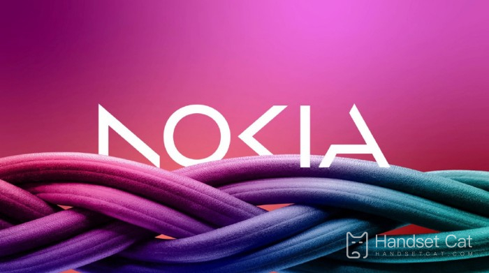
On February 27, according to Reuters, Nokia announced its plan to change its brand image for the first time in nearly 60 years and launched a new logo on Sunday. The new logo is composed of five different shapes, forming the word "NOKIA". In addition, the iconic blue in the old logo has been replaced by a series of colors. CEO Pekka Lundmark said in an interview: "This (old logo) is related to smart phones. Now we are a commercial technology company.
Since Pekka Lundmark became the chief executive officer on September 1, 2020, he has begun to formulate new strategies and change the business model to achieve sustainable profit growth. Its corporate strategy is carried out in three stages, namely replacement, acceleration and expansion. At present, Nokia has completed the first phase of work and is about to enter the second phase, focusing on B2B technology, achieving strong growth and stable profitability while expanding its customer base, and maintaining its leading position in the field of network technology.
In Nokia's view, it is time to change its brand image to start business. The background color of the new logo has been changed, and the word "Nokia" is composed of five different shapes. Pekka Lundmark said that in the future, more attention will be paid to the network and industrial digitalization to reshape the new brand image. Although Nokia's authorized manufacturer of branded mobile phones, HMD, has expanded the production and marketing scale of Android smartphones in many markets, it is clear that the mobile phone business is no longer the focus of Nokia.
Pekka Lundmark saw a lot of opportunities in the enterprise market. Last year, Nokia's enterprise business increased by 21%, accounting for about 8% of its sales, to 2.11 billion euros. Nokia hopes to increase the revenue of enterprise business as soon as possible and increase the proportion of sales to double digits.
At present, Nokia's focus is obviously no longer on mobile phones. Although it is still producing new mobile phones, it has not made any waves. The new logo of Nokia is also a farewell to Nokia, which is dominated by smart phones, and will shift its focus from smart phones to network technology.